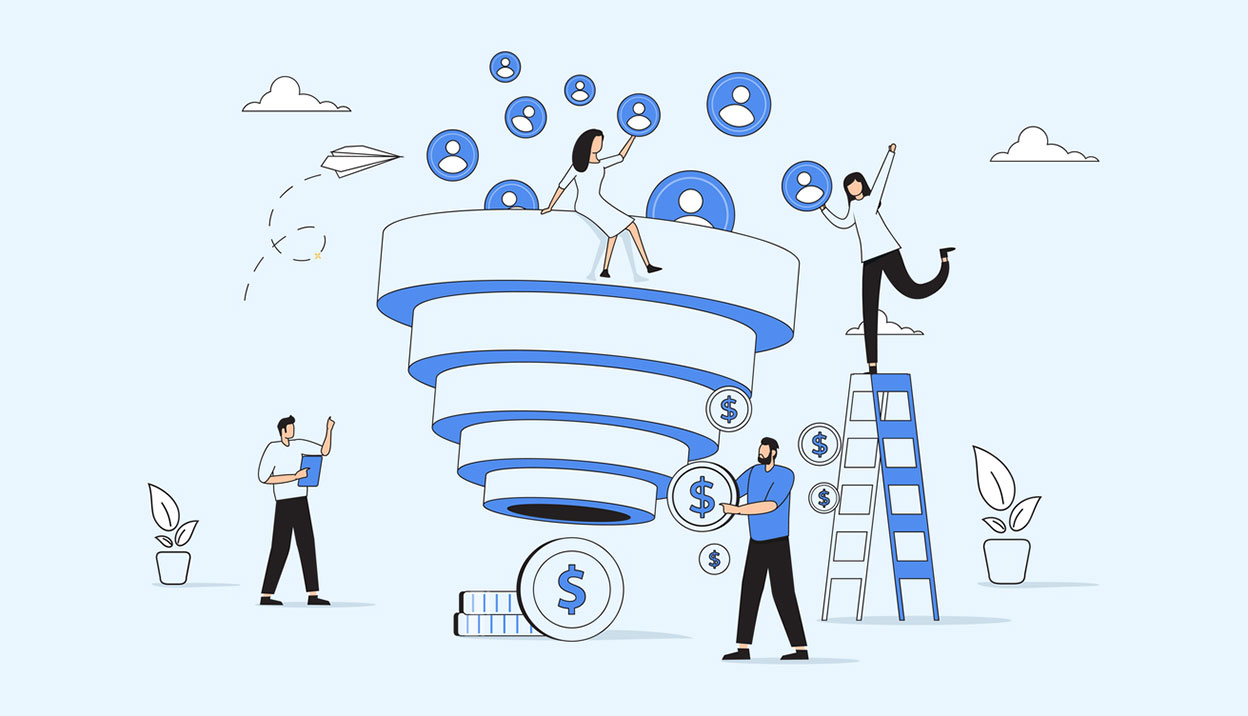
Visualising your online customer funnel
One of the ways that you can track customer interaction is through a conversion funnel approach, which will be familiar to anyone with a sales background. Coming in at the top of the funnel you have new customers. In the sales model, you communicate with them in various ways by sending them brochures and proposals, and in turn they express an increased interest in your offering. At the bottom of the funnel are the customers that actually commit to your offering. The whole point is to measure how many people you convert from newbies to customers - your conversion ratio.
Measuring your funnel online
For a site or web application that sells a product or service, the traditional funnel approach works well since it’s relatively easy to track user interaction on the web. Not only can we track things by looking at server logs & and page analytics, we can also use database analysis to gain a much deeper understanding of the interaction.
There is an article by Michael McDerment from Freshbooks (a web site that allows you to manage your invoices) on this subject: How to measure the success of your web app. In it, he describes a simple model (visit > trial > buy) as well as a more sophisticated approach (visit > trial > active > pay). He goes on to discuss ways you can go about measuring your conversion funnel.
Michael also makes the point that the initial funnel is important, however how a customer behaves once signed up is actually more important. Do they stay signed up for the next month? Do they even use the service, or do they find it not useful or too hard, and do they upgrade to a bigger package?
There is an interesting discussion on working out just how leaky your funnel is and setting realistic targets for the top of your funnel in Measure the Real Conversion Rate & Opportunity Pie, and then debunked in this post.
But what if your site isn’t about buying or signing up?
What if your site isn’t about buying or signing up? Many of the projects that Red Ant works on aren’t based on an ecommerce transaction, where the customer walks off into the sunset with a product. Often the reason for being is brand interaction and exposure- a chance for a company to engage with customers in a way that is simply not possible in other mediums such as television. For this kind of site, simple conversion points (how far along the funnel you are) aren’t as meaningful. What’s more, they are harder to measure and assess. In the sales funnel approach above, the customer represents value to the site only once they’ve passed through the end. In this second type of site, a customer might pass through many different points of potential value.
Benchmarking is also difficult. First, there isn’t an easy metric like a sale with attributes (how many items, how much $) that can be measured. Secondly, the comparisons tend to be a bit vague. For example, at what point does a customer become engaged - 10 seconds or 10 minutes or 10 clicks? Apart from vague, things can be downright confusing - what might seem great customer response (a surge in unique visits) might actually be bad when deeper analysis reveals that these visitors are just coming for a promotion give away, and then rarely return.
Visualisation
One of the big challenges is communicating what this customer funnel looks like, and how it behaves. Once people can visualise what is occurring, then it’s often easier to explain or contextualise strategies for the various points.
Here is how we’ve explained it as an overview:
(Flash removed)
image credit: Scott Ableman
Online visualisation of your customer funnel
Ben Still
-
13 Jul 2009