Refactoring a design

I won’t bore you with all the various tweaks and changes, but one page in particular was interesting in terms of refactoring a design. The page was a product menu. It lists several product groups and the products within each. Each product menu has between two and seven groups of products.
Need to cut to the chase? Here is our original version (Content Management System), which we redesigned it to be faster and more useful. You can play with the new version here.
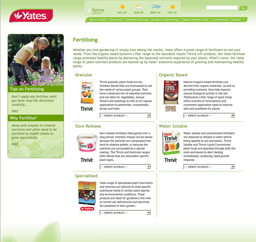
The original version
Our original version was this:
This was (in my opinion) a good example of something that photoshops well, but is not particularly usable in when filled with real data. This wasn’t evident until the site was live and filled with real content, and you needed to find something specific (rather than a product) or browse around a product area.
Each product area has a drop down list, which shows a set of product names that you select from:
This design worked well if:
- you knew the exact name of what you were looking for (so you could find it in the list)
- you could find the item easiest via an alphabetical ordering
- once you’d selected a product, you didn’t want to jump to another
- the product area blurbs were helpful for you in your search
Refactoring
It’s not that there was anything that wrong with the original layout. The design neatly fits all the required information in, plus a blurb about each of the product areas. We designed this area so someone could get to any product with a minimum number of mouse clicks- and measuring against this metric the design is successful.
However, we all thought there were a few ways that we could improve the page, and make it more useful:
- we dropped the text summary to get back some space
- arranged each area in a vertical list rather than a grid. Each item expands to show all the products within. Clicking on another product area collapses the first.
- used thumbnails of each product as a visual aid.
- increased the size of the mouse click hit area to make it easier to click on a specific product (the previous select list made it easy to choose one product too high/low if you weren’t careful with your mouse)
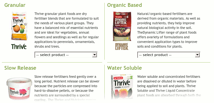
Here is the revised design, and you can play with it here
Revised design for the Yates product menu
Revised design for the Yates product menu
We thought that using thumbnails of each product might be a nice idea, but it was only when we prototyped real data such as the tools menu that we could see how useful a thumbnail would be in this instance. The tools menu lists all different types of secateurs, saws, and tree cutting devices. There is no way you could know whether the ARS Fruit Pruner 300L is the same or different to the ARS Fruit Pruner SE30 (they are different) by looking at the product names. But it is quite clear from the thumbnail that the SE45 is closer to the 300L.
Another thing that we didn’t realise during the initial design phase was how products are named. Yates often include the brand or product area as part of a name, which makes for a lot of repetitive data in each. This repetition makes it hard to scan a list and pick the difference when displayed in the way that we had it. Having thumbnails greatly help with this problem.
Avoiding the waterfall
The design process for a web site works well when iterations or design cycles are allowed/encouraged to occur. For us, this means avoiding waterfalls- where one person or team does a bit, then passes it on to the next. Tasks progress from one stage to the next in one direction- rarely going back upstream. For web sites, they often look like this:
- one person makes a wireframe UI
- who passes it on to another to get it signed off by the client
- and then on a designer to photoshop
- then on to an HTML person to cut
- and then somehow squeeze it into a CMS or web app
Since someone has diligently been getting signoffs at critical points, there is little opportunity or motivation for someone towards the end to redress issues- in fact it often becomes progressively harder (that’s already been signed off). You’ll end up with exactly what you asked for, but it might not be the most satisfying process or final result.
The way we try to tackle this issue is to involve everyone as early as possible, and get them operating as an autonomous team. If someone sees something that is not ideal or presenting problems with their own stage, we try and fix it (aka repairing broken windows) by taking it back upstream.
In this instance, the design had gone pretty much all the way through our process. But by looping back and spending some additional UI and design time, we were able to resolve other issues eg: the grid layout was difficult and taking time to maintain across different browsers, and adding in additional areas was a manual HTML/CSS task. We were also able to make significant improvements to the usefulness of the screen.
image credit: David DeSandro
We've recently spent some time adding some new features to a site that we built a while back.
Ben Still
-
30 Jul 2009


